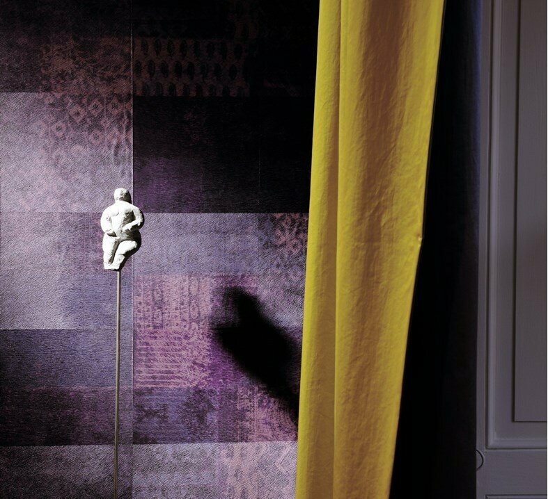
One of the greatest color authorities in the world - PANTONE - dictates the trends again!
The color of the year is Ultra Violet: a mystical, electrifying, dramatic and futuristic tone. Unconventional, this color emerges to make us go a little bit further. In addition, this color is full of magic and mystery - it's awake the senses, it is an impulse that amaze us because of its eccentricity and uniqueness.
Opening doors to this color is also to a way to receive, at home, a tone that awakes emotions and generates opinions. For the more daring, they now have a chance to risk; or for the more conventional, they can opt for small stylish appointments in ultra violet.
Take this color to your daily life and light up 2018!
HOME DECOR


Forgetting the minimalism: Pantone brings bold proposals, full of uniqueness and encourages the use of strong colors even in for home decoration. Another 8 tones dominate the trends that promisse to create unique and surprising scenarios, full os style! Choose the colors you like the most and give a twist to your home interior.
New year, new colors
Discretion: pastel pink
Proof that pink has come to stay! A tone that came last year and, still in 2018, is not only a statement but also make us recognize the power that this color has these days.
Far-fetched: warm tones
A great trend to embrace colder seasons, as earthy colors have the power to make environments warmer and more comfortable. It is also the mix between different cultures, by the panoply of colors that intersect in this Far-fetched.
Intencity: bordeaux, brown and gold
The power and sophistication in a blend of three shades that you'll want to use in decorating in 2018. To create darker settings, or simply to use in small notes, check out our proposals and get inspired.
Intricacy: a mix between three tones - yellow, wine and mettalics
A tribute to modernity. If at first sight this combination seems risky, in the decoration those colors won't go unnoticed. It's a mixture that promises to draw attention to even the most distracted people. At home, it will add personality and character to every space.
Playful: yellow
Open the door to happiness. This is the motto! One of the choices of 2018 but that you can lead for your life. Yellow is a color that is as happy as it is fun and you can, and should, add to the decoration of your home. On furniture, on a wall, do not be afraid to use this color. After all, it's one of the trends of this new year.
Resourceful: blue and orange
When the warm tones blend with the cold ones. Don't you believe? This is one of Pantone's most impressive proposals. For the more daring people, orange mixed with blue will be the choice for a cheeky, very stylish and full of personality decoration.
Tech-nique: turquoise and pink
Two shades that form an unexpected pair but in fact prove to be a surprisingly and beautiful combination. A Pantone's choice that may not be consensual or easy to apply, but you should be creative and don't be afraid to take risks. It's a tribute to the technology that you can take to your home by combining, for example, some pink and turquoise accessories .
Verdure: vegetable colors
Pantone has not forgotten about mother nature and created this color scheme, It is a suggestion to take positive energy, the benefits of nature, tranquility and peace to your home. Allow the green to dominate in the decoration, in chairs, accessories or utensils.
About the authorTeresa Pontes.
Letters are her huge passion and writing is what fascinates her the most. She has understood that decoration can be so charming as the words, so, gathering together the two areas is an amazing challenge, as well as the culmination of a very rewarding adventure. To be involved in a project like store.inexistencia.com and, consequently, with the blog is really overwhelming.